Extracting Meaningful Insights from Data using Exploratory Data Analysis

Introduction
Exploratory Data Analysis (EDA) is a set of techniques used for data exploration. It identifies interesting characteristics, relationships and patterns, key attributes and anomalies. EDA is facilitated through graphical and statistical analysis.
Demonstration
I would like to share my understanding through an example EDA that I have performed on Wine quality data set, obtained from the UCI Machine Learning repository. The following are few of the insights I have derived from the analysis. The objective of the analysis is to understand how each factor influences the rating of wine.
EDA involves the following steps:
- Calculating mean, median, mode and quartile values of the data in each column of the data set.
- Visualising the data and observing how the values are distributed.
- Identifying outliers (data that do not fall within the ambit of our analysis).
- The range of data in each column is calculated, which can show us the magnitude of values present as well as the minimum and maximum values.
Data Preparation & EDA
Data is collected from various sources and loaded to data warehouse using Pentaho+ Data Integration. The Pentaho Plus Data Integration Tool performs the cleansing, transformation, applying rules and stores in data warehouse.
This data is further used for the exploratory data analysis, creating data pipeline and building model.
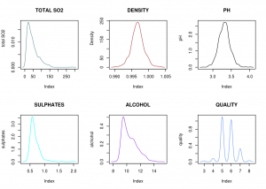
Uni-variate plots help in understanding the nature of values in each of the attributes.

Line plots for the variables in the data
From the above line plots, we can infer that pH and density have normal distribution, whereas SO2, sulphates and alcohol have skewed distribution. Quality shows comb distribution, which means that certain data points may have been rounded off to the nearest whole number.
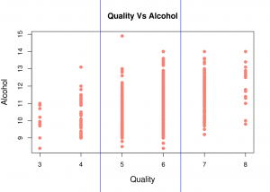
Bi-variate plots help in understanding the relationship between two plotted attributes.

Quality Vs Alcohol scatter plot
From the above scatter plot, we can infer that good-quality wines usually have higher alcohol content than low-quality wines .
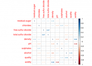
Correlation Plot shows linear correlation between two variables.

Correlation plot
From the above correlation plot, we can list the attributes that are strongly correlated:
Quality and Alcohol (positively correlated)
Density and Acidity (positively correlated)
Density and Alcohol (negatively correlated)
Free SO2 and Total SO2 (positively correlated)
Acidity and pH (negatively correlated)
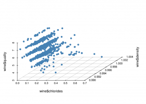
Multivariate Plots find relationships between more than 2 variables. They become difficult to interpret when the number of variables is greater than 3.

3-D scatter plot
From the above graph, we can infer that most good-quality wines contain less amount of chlorides and an acceptable density.
Conclusion
Various types of plots and techniques are available to represent and analyse your data like Box plot, Histogram, Run chart, Pareto chart, Scatter plot, Odds ratio and more. It is crucial to utilise the right plot so as to grab the essence of pattern from the data.
Therefore EDA is the process of obtaining any possible intuition regarding the data in the beginning itself. Skipping this process might lead to skewed data with too many outliers and missing values. This, in turn, could generate inaccurate models, lead to choosing wrong variables for the model or the wrong model itself.
