Pentaho+ Data Visualization Google Calendar Chart Usage Limitations

A calendar chart is a data visualization used to show activity over the course of a long span of time, such as months or years.
What is google calendar chart?
They are best used when you want to illustrate how some quantity varies depending on the day of the week, or how it trends over time.
Like all Google charts, calendar charts display tooltips when the user hovers over the data. And credit where credit is due: our calendar chart was inspired by the D3 calendar visualization.
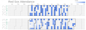
With a calendar chart, we can use brightness to indicate the values and let people see trends at a glance
To create a calendar chart, load the calendar package and then create two columns, one for the dates and one for the values.
Days
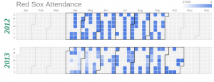
Each square in a calendar chart represents a day. Currently, the color of the data cells can’t be customized, although that will change in the next release of Google Charts.
If the data values are all positive, the colors will range from white to blue, with the deepest blues indicating the highest values.
If there are negative data values, they will appear orange
You can change the size of the days (“cells”) with the calendar.cellSize option
Days with no data values can be customized with the noDataPattern option
You can control the cell border color, border width, and opacity with calendar.cellColor option

Weeks
By default, the days of the week are labeled with the first letters of Sunday through Saturday. You can’t change the ordering of the days, but you can change what letters are used with the calendar.daysOfWeek option.
Also, you can control the padding between the days of the week and the chart with calendar.dayOfWeekRightSpace and you can customize the text style with calendar.dayOfWeekLabel

Months
By default, months are identified by dark grey lines. You can use the calendar.monthOutlineColor option to control the borders, the calendar.monthLabel to customize the label font, and calendar.underMonthSpace to adjust the label padding

Years
The years in calendar charts are always on the left edge of the chart, and can be customized with calendar.yearLabel and calendar.underYearSpace
We set the year font to a dark green 32pt Times-Roman bold italic, and add ten pixels between the year labels and the bottom of the chart

Finally call these calendar source code from google calendar charts to Pentaho+ query component to get viewed in browser.
By using calendar charts, we can analyze the employee attendance by days, weeks,months and compare yearly attendance. Also, it is used to analyze the employees attendance with department wise.
