How Exploratory Data Analysis helps in gaining meaningful Insights

I. Introduction
Descriptive Statistics provides information related to Magnitude and Range of the data, which is quite useful to an analyst, but, other important aspects about the data such as its Relationship and Distributions are difficult to understand by just looking at the summary statistics. For example, consider the following statistics of a sample data-set with 50 observations and two variables, X and Y;
        X                  Y
 Min.   :-2.53164   Min.   :-2.69579
 1st Qu.:-0.59649   1st Qu.:-0.68995
 Median : 0.03801   Median : 0.08653
 Mean   : 0.17756   Mean   : 0.19947
 3rd Qu.: 1.07118   3rd Qu.: 1.18404
 Max.   : 2.24424   Max.   : 2.75885
With the above given information it is hard to detect the patterns and anomalies in the data, as almost nothing significant or relevant can be deciphered from the statistics.
This blog focuses on Exploratory Data Analysis and how it plays an important role in obtaining meaningful and useful information from the data using Visualization, where numbers and statistics fail.
I will be using ‘R’ Language and it’s associated libraries to provide suitable examples wherever required.
II. Exploratory Data Analysis
Data is collected from various sources and loaded to data warehouse using Pentaho Data Integration. The Pentaho Data Integration Tool performs the cleansing, transformation, applying rules and stores in data warehouse.
This data is further used for the exploratory data analysis, creating data pipeline and building model.
Data Analysis using visualization is an effective way to understand its relationship and distributions. The three major types of Visualization are;
- Univariate Visualization – Univariate plots are plots of individual attributes without interactions. Some of the visuals are frequency distribution tables, bar charts, histograms, or pie charts.
- Bivariate Visualization – Bivariate plots allows to assess relationship between two variables in the data-set. Some of the visuals are Scatter Plot, Box Plot or Mosaic Chart.
- Multivariate Visualization – Multivariate plots are plots of the relationship or interactions between attributes. Some of the visuals are Bubble Chart, Geo Map and Tree Map.
In this blog, much of our sample visuals are Bivariate Visuals. To explain why visuals are important part of analysis for any data intensive project, let us visualize our previous sample data-set;
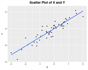
The above plot depicts a Linear Relationship between the two variables, this information would have been missed if one would have relied purely on basic descriptive statistics.
To understand further on why EDA is important, let’s consider another example of four data-set’s, with each data-set containing two variables(X and Y) with 11 observations each.
| DataSet 1 | DataSet 2 | DataSet 3 | DataSet 4 | ||||
| X1 | Y1 | X2 | Y2 | X3 | Y3 | X4 | Y4 |
| 10 | 8.04 | 10 | 9.14 | 10 | 7.46 | 8 | 6.58 |
| 8 | 6.95 | 8 | 8.14 | 8 | 6.77 | 8 | 5.76 |
| 13 | 7.58 | 13 | 8.74 | 13 | 12.74 | 8 | 7.71 |
| 9 | 8.81 | 9 | 8.77 | 9 | 7.11 | 8 | 8.84 |
| 11 | 8.33 | 11 | 9.26 | 11 | 7.81 | 8 | 8.47 |
| 14 | 9.96 | 14 | 8.1 | 14 | 8.84 | 8 | 7.04 |
| 6 | 7.24 | 6 | 6.13 | 6 | 6.08 | 8 | 5.25 |
| 4 | 4.26 | 4 | 3.1 | 4 | 5.39 | 19 | 12.5 |
| 12 | 10.84 | 12 | 9.13 | 12 | 8.15 | 8 | 5.56 |
| 7 | 4.82 | 7 | 7.26 | 7 | 6.42 | 8 | 7.91 |
| 5 | 5.68 | 5 | 4.74 | 5 | 5.73 | 8 | 6.89 |
The above given data-sets almost look identical, moreover they look pretty clean, any analyst would be tempted to start building statistical models on it. Now, lets run some basic analytical tests on the data-sets and observe the outcome.
   "Descriptive Statistics"
        X            Y
 Min.   : 4   Min.   : 3.100
 1st Qu.: 7   1st Qu.: 6.117
 Median : 8   Median : 7.520
 Mean   : 9   Mean   : 7.501
 3rd Qu.:11   3rd Qu.: 8.748
 Max.   :19   Max.   :12.740
The statistics does not relate the data in any way, almost all the statistical output of the data-sets look identical, with X variables of the data-sets having a mean of 9 and Y variables of the data-sets having a mean of 7.50, not much meaningful insights can be obtained from the descriptive statistics of the data-sets. Now, let us visualize the above four data-sets;
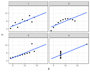
From the above visualization, we can notice that all four data-sets have different relationship;
- DataSet One – Linear Relationship
- DataSet Two – Non-Linear Relationship
- DataSet Three – Linear Trend with a Outlier
- DataSet Four – Constant (No Trend – Regression Line fits only two data points)
The above data-sets are part of ‘Anscombe Quartet’s’, where the descriptive statistics for the data-sets are almost identical, but, upon visualization each of the data-set represents a different relationship. Thus, visualizing the data-set is much more effective than simply using descriptive statistics and jumping on to building statistical models.
III. Conclusion
Exploratory Data Analysis is a powerful tool, which provides great opportunity to test business hypotheses and gain insights about the data before jumping into Model building. Data Cleansing, Normalization, and Data Mining are all part of EDA, in other words, EDA is like gold digging – you are looking for something specific, one needs to have proper goal in order to obtain specific insights which could help businesses to develop and grow.
In my next blog, I will discuss in detail about Data Cleansing and Normalization, how they are pretty much important to obtain relevant business insights.